About
Randy Krum
President of InfoNewt.
Data Visualization and Infographic Design

Infographic Design

Infographics Design | Presentations
Consulting | Data Visualizations

DFW DataViz Meetup

Join the DFW Data Visualization and Infographics Meetup Group if you're in the Dallas/Fort Worth area!

Search the Cool Infographics site

Custom Search

Subscriptions:


Feedburner

The Cool Infographics® Gallery:

How to add the
Cool Infographics button to your:

Cool Infographics iOS icon

- iPhone
- iPad
- iPod Touch


Read on Flipboard for iPad and iPhone

Featured in the Tech & Science category

Flipboard icon

Twitter Feed
From the Bookstore

Caffeine Poster

The Caffeine Poster infographic

Entries in money (137)

Tuesday
Oct252011

What is a Stock?

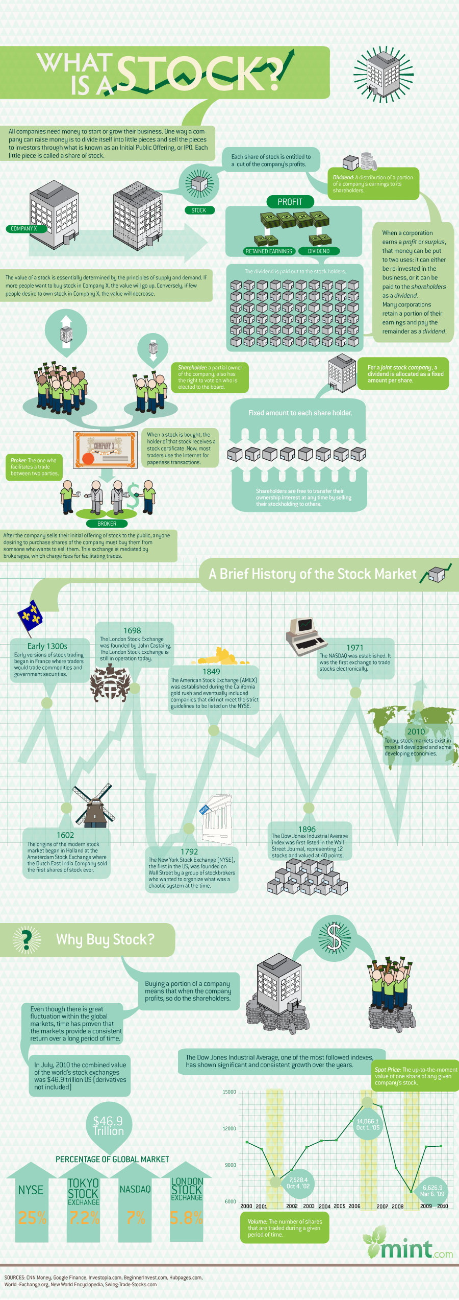
What is a Stock? from Mint.com explains what stock ownership is.  It’s informative to the readers (a little text heavy), and doesn’t come across like an ad.

To make investment choices that ultimately pay off, you need to start by knowing the fundamentals. It’s a step many investor wannabes skip, since… well, studying the basic terms and trends is not exactly entertaining. We thought one way of helping you get a jumpstart on your basic investing terminology is a series of infographics that explain, visually, basic concepts. First up: what is a stock?

This is a good example of what I call the Online Lifespan of an infographic.  Instead of an infographic about a recent news topic, this one covers an informational topic that doesn’t change or drop out of the news cycle.  It’s more than a year old, but the information is still relevant, and continues to drive traffic for Mint.  This design probably has an Online Lifespan for 4-5 years before the Dow Jones chart at the bottom makes the whole infographic feel dated.

What’s the line chart in the middle?  It’s a timeline, but the height of the line chart has no meaning whatsoever.  This should have shown some type of information, but instead is just confusing to the reader.

Thanks to Dawn for sending in the link!

Friday
Oct212011

UN Against Corruption infographic video

This UN Against Corruption infographic video is actually a highlights overview of a six-part video series from the UNCAC (UN Convention against Corruption) Coalition.  This video does a good job of showing how corruption impacts societies, escpecially in third world countries.  You can view the complete series at http://www.uncaccoalition.org/en/uncac-review/uncac-review-mechanism.html

Highlights of the six-part suite of 2D infographics videos commissioned by Transparency International in collaboration with UNODC. This video infographic uses animated typography and simple, iconic animated graphics and pictograms to explain the effects of corruption on society. It also incorporates a short segment of live-action video, embedded within the context of iconic elements. It provides a compelling and fast-paced tutorial for organisations and activists on how to bring pressure to bear on governments to more effectively fight corruption.

Credits:

  • art direction: mariano leotta
  • motion graphics: alessandra leone
  • sound design: ex-directory
  • sound mixing: enrico anicito guido
  • voice over: tom tucker
  • shooting: luca fuscaldi
  • production: artereazione.org
  • commission: transparency.org

The full six-part series is now available on YouTube:

Tuesday
Aug092011

Client Infographic: A Solar Innovation Story

Solar Savings: A Solar Innovation Story from ExtraSpace.com is a new infographic by InfoNewt and designer Jeremy Yingling.  This one tells the story of how the company is adding solar panels to the roof space on some of it’s self storage facilities all across the country.  The environmental, financial and community benefits are huge, and this was only the first year of a multi-year plan.

Extra Space Storage is on a mission to produce solar powered clean energy and reduce the carbon footprint of our 850+ self storage facilities. We aim to install 20,000 solar panels this year, and increase the pace of panel installation every year. Energy efficient clean power is good for our customers and our neighborhoods, our planet, and our investors. By the end of 2011 this program will save 2,000 tons of carbon dioxide and 100 acres of fir trees.

An infographic is a fantastic way for Extra Space to tell their story to customers, investors and anyone interested in alternative energy solutions.  It puts their efforts into context and shows the potential of how large their cumulative environmental impact could become.

You can follow Extra Space Storage on Facebook and Twitter (@extraspace)

Monday
Aug082011

Visualizing the U.S. Debt

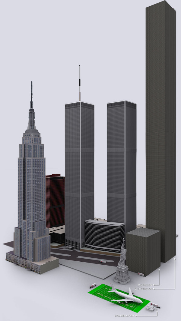
The U.S. Debt Visualized is a great visualization of scale, and can be found at usdebt.kleptocracy.us, where you start with a single $100 bill, and start stacking them in orders of magnitude.  Stack them on pallets, start stacking the pallets and show them in comparison to other real-world items.

$114,500,000,000,000. - US unfunded liabilities
To the right you can see the pillar of cold hard $100 bills that dwarfs the
WTC & Empire State Building - both at one point world’s tallest buildings.
If you look carefully you can see the Statue of Liberty.

Numbers this large become too big to truly comprehend to many people, and I love visualizations like this one that put the unbelievable high numbers into context and scale.  Here’s one trillion dollars:

A visualization like this has a natural bias.  Whatever object the designer chooses to show in relation to the stack of bills can make the pile appear large or small in comparison.  In this example, the piles of money are truly staggering, but that’s all the reader can walk away with.  In it’s defense, this visualization isn’t trying to propose a solution, it’s just trying to make the viewer understand how big the number is.

Found on SeeWhatYouMean, VizWorld, Business Insider and Information Aesthetics.

Friday
Jul012011

Client Infographic: Waste in the Texas Energy Market

Waste in the Texas Energy Market from ChooseEnergy.com is a new infographic by InfoNewt and designer Jeremy Yingling.  This one tells the story of how much money is NOT being saved by households that don’t take advantage of lower pricing since Texas has a deregulated electricity market.

As the economy struggles to recover and households continue to cut back on spending, one of the easiest ways to save money might just be in your electric bill. In these tough economic times, consumers realize the importance of watching how every penny is spent. Today we look at the “Waste in the Texas Energy Market” and how pennies can certainly add up quickly to improve consumer finances.

Following the Infographic Release Strategy from InfoNewt, ChooseEnergy also did a great job setting up a dedicated landing page and custom URL for the infographic.  All of their links then drive traffic to this single page.  So the company blog post, Twitter feed and Facebook posts provide additional descriptions and links to this landing page.

While highlighting the fact that the Texas energy market is the 11th largest in the world, the infographic also shows that 48% of the electricity consumed is from residential use.  So what’s the big deal?  On average Texas residents pay about 11.5 cents per kWh for their home electric use when they could be paying 8.5 cents per kWh.   Doesn’t sound like much does it?  Well, those 3 pennies can add up fast and they add up to $3.7 billion for the Texas consumer market.

You can follow ChooseEnergy on Twitter at @texas_electric

Friday
Jun242011

Britain's Changing High Street Businesses

From SimplyBusiness.co.uk comes the Our Changing Highstreet: The Rise and Fall of High Street Shops infographic.

A third of independent High Street shops are now cafes, pubs, restaurants, and takeaways, a major new survey from Simply Business has found.

The survey, which looked at some 75,000 businesses quoted by Simply Business between 2008 and 2010, also found that hairdressers and beauty salons are beginning to thrive – with the former now the most common type of non-hospitality establishment on the High Street.

But retailers have fared worse, with clothes shops and newsagents showing a marked decline during the period.

Unsurprisingly London remains the country’s foodie heaven – with restaurants now making up 11 per cent of the capital’s High Street businesses.

I like the different ways to look at the data, and the connecting lines in the changing ranking visualization are really well done.  I like the ones that connect to additional listings below the visuals, presumably to the actual location on the listing.

I don’t understand some of the ranking change visuals off to the right.  Computer shops fell from #12 to #14 in the list, but the change visual shows “New Entry” instead of Down 2?

Apparently I should go drinking in Wales though!

Thanks to Mark for sending in the link!

Thursday
Jun162011

The Business of Giving


The design of The Business of Giving from SocialCast does a good job of walking the reader through a story about companies donating to charities.  However, they could have done more to visualize the scope of donations instead of just including the dollars values in text.

In the Popular Causes section, I would have built the icons right into the pie chart.  They don’t serve much purpose on their own next to the chart.

I love the puzzle piece images used for Partnerships.

Designed by Column Five Media

Tuesday
Jun142011

Microsoft: The Mobile Commerce Revolution


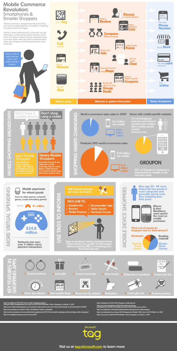
The Microsoft TAG team has released a new infographic focused on intelligent shoppers.  Mobile Commerce Revolution: Smartphones & Smarter Shoppers looks at the data behind how we use our smartphones to compare prices, look-up coupons, make purchases with our phones and more.

This is a very busy infographic, with some great data hidden inside.  I like the visuals and the isotype style, but there isn’t a cohesive story or clear path for your eye to follow.  The e-commerce sales growth from 2009 to 2015 is a huge data point and should be much more prominent.

Thanks to Nick for sending in the link!

Tuesday
May242011

U.S. Education vs. The World

U.S. Education vs. The World is a very cool infographic from MAT@USC.  You can imagine this data as a boring series of bar charts in an academic report, but the colorful, visual design here is fantastic.  The winding connecting lines can make it a little difficult for the reader to understand the data, but I think it also draws the reader in like a simple puzzle.

We’ve put together this infographic that compares the United States’ education spend and performance versus eleven countries.  The U.S. is the clear leader in total annual spending, but ranks 9th in Science performance and 10th in Math.

Thanks to Sarah for sending in the link!

Wednesday
May182011

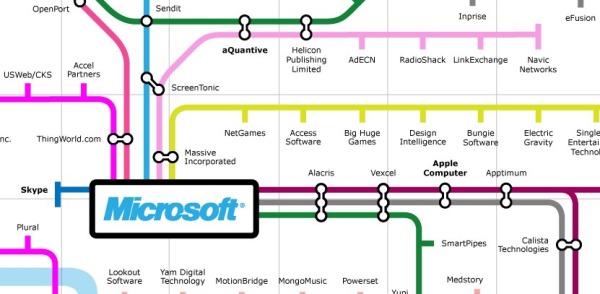
Microsoft Acquisitions Subway Map #infographic

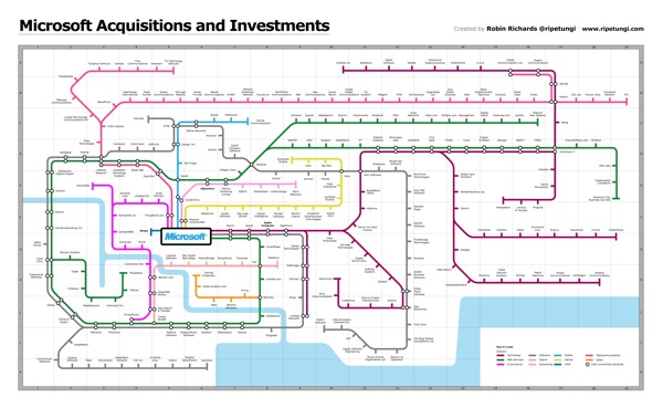
Robin Richards (@ripetungi) recently updated his fantastically detailed subway map of Microsoft Acuisitions and Investments.  Although Robin is the Information Design Director at JESS3, this is one of his personal projects.

Infographic showing the acquisitions and investments of Microsoft, done as a tube map with each coloured line representing a different industry for each acquisition or investment.  Where the stations meet is where the two industries overlap.  The key at the bottom displays information about the location on the map of the station (company) the year of acquisition or investment.


This thing is big!  Poster-sized big.  I dropped the link into Zoom.it so it would be easier for you to zoom in closer and see the details.


Great job Robin!  I love this project.