About
Randy Krum
President of InfoNewt.
Data Visualization and Infographic Design

Infographic Design

Infographics Design | Presentations
Consulting | Data Visualizations

DFW DataViz Meetup

Join the DFW Data Visualization and Infographics Meetup Group if you're in the Dallas/Fort Worth area!

Search the Cool Infographics site

Custom Search

Subscriptions:


Feedburner

The Cool Infographics® Gallery:

How to add the
Cool Infographics button to your:

Cool Infographics iOS icon

- iPhone
- iPad
- iPod Touch


Read on Flipboard for iPad and iPhone

Featured in the Tech & Science category

Flipboard icon

Twitter Feed
From the Bookstore

Caffeine Poster

The Caffeine Poster infographic

Entries in timeline (240)

Friday
Dec132013

100 Years of Rock Visualized

100 Years of Rock Visualized infographic

From Gospel to Grunge: 100 Years Of Rock in Less Than a Minute is an ambitious design project from ConcertHotels.com.  It’s an animated, interactive timeline design that let’s you click on any genre to highlight it’s specific history and play a sample of the appropriate music.

The history of rock music is pretty interesting. Everyone knows that it’s roots lie in genres like Gospel, but what about all the other genres?

How did Cowpunk come about? Or Indie Rock? Or Nu Metal?

These are the sorts of questions we ask ourselves here at Concert Hotels (oh, and other important topics like what we should have for lunch).

Curiosity piqued, we decided to trace the roots of the various rock genres, kinda like ‘Who do you think you are?’ but for rock music, and then visualize it.

We embarked upon what turned into a mammoth research task, the likes of which none of us have undertaken since college. But we stuck with it. We think it was worth the effort.

Ladies and gentlemen, we give you our Rock Time Machine - click here to journey through 100 years of rock in less than a minute.

And there’s more - while we were at it we thought it might be pretty cool to be able to hear a sample of each genre.

So turn your speakers up to 11 (or pop your headphones in if you’re the considerate type) - you never know, you might just find a new music genre to fall in love with.

Although music heritage isn’t an exact science, the color-coded flow arrows are easy to follow throughout the design.  However, they get more complicated at the bottom.  Apparently there hasn’t been any new music since Y2K?

Found on Fast Company


Friday
Dec062013

29 Powerful Tools for a Social Media Marketer

29 Powerful Tools for a Social Media Marketer infographic

A Productive Day in the Life of a Social Media Marketer from Razor Social is a great use of an infographic design within a larger content strategy online.  The larger piece is an article that lists out all 29 tools, with links and descriptions, but the infographic shows a character using all of the tools throughout the day.  So the infographic grabs the attention of the audience and gets shared frequently, with links back to the full article.

The demands on us to market our products and services using social media is constantly increasing and the technology/tools required to support this is also increasing.

We start early morning and we finish late at night.  How many of you check your Twitter or Facebook account last thing in the evening and first thing in the morning?

So we thought it would be a good idea to take a look at a very busy day in the life of a Social Media Marketer.  During the  day there are so many tools and tasks.  If you work alone then we certainly wouldn’t expect you to do everything listed here or use all the tools we suggest, but if you are part of a team then you could share out the tasks and tools to make it easier.

A special thanks goes to Donna from Socially Sorted who is my go to person when I want anything visual done.  Thanks Donna.

The infographic design does a good job of removing most of the text descriptions and just using icons and logos to represent the various tool.  Interested readers can dig into the full article for more information.

The footer is missing the URL link back to landing page with the article.  When people post infographics on blogs and social media sites, they aren’t always good about linking back to the original.  By including the text URL in the infographic itself, you can make sure all of the readers can find the landing page.

Tuesday
Nov262013

Thanksgiving Timed Right

Thanksgiving Timed Right infographic

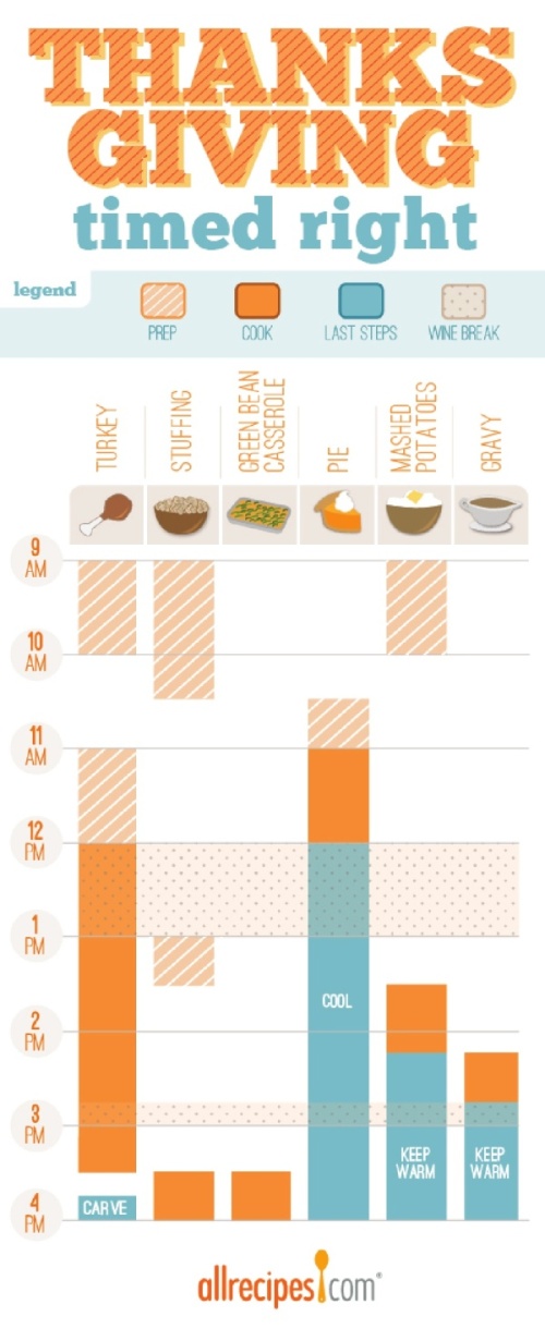
Thanksgiving Timed Right is a timeline infographic from allrecipes.com that helps everyone plan when to start cooking each dish for Thanksgiving dinner.  You want everything to make it to the table at the same time right?  I especially appreciate the Wine Breaks!

Great idea, and I know many, many people that struggle to figure this out on their own.  As an infographic released on the web, it really needs to have the URL back to the original full-size version included in the footer.  Many people are going to share this infographic with friends and family, but very few with correct link back to the Fresh Bites Blog where you can find the original.

The topic choice here is fantastic!  This design will have an Online Lifespan of many years as people go looking for this information every November.

Also found posted on Scribd by StephanieRobinett

Friday
Nov082013

Apple Release Patterns

Apple Total Release Patterns infographic

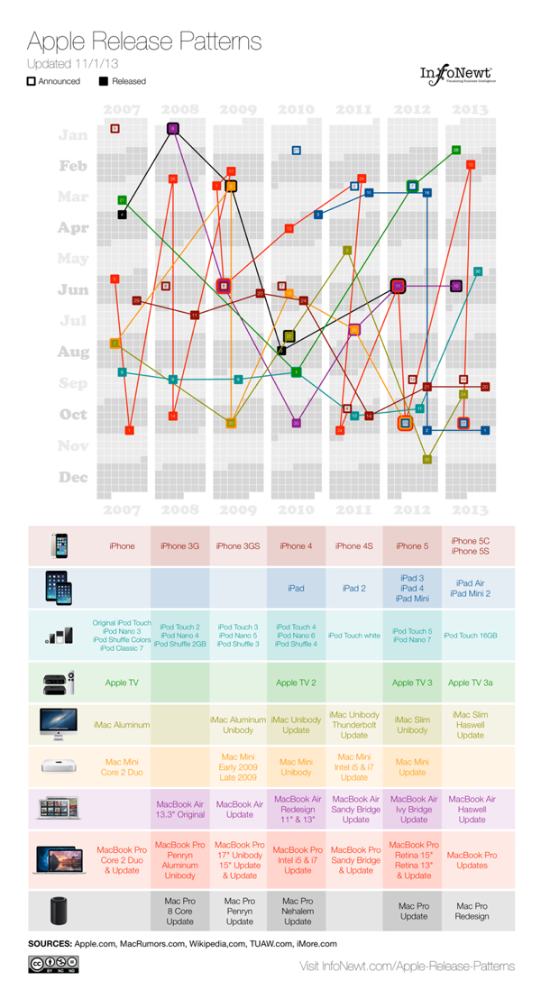
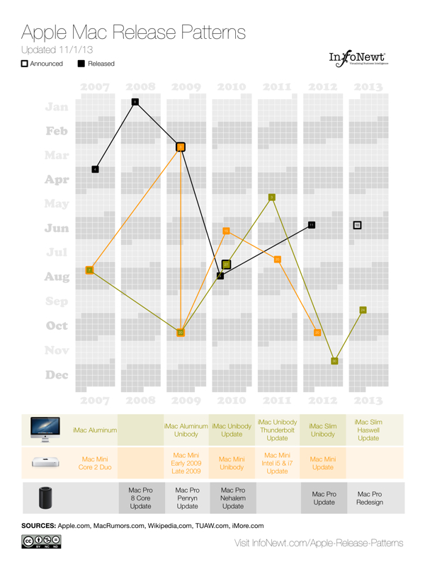
Apple Release Patterns is a new personal project of mine, and you can find the full-size original versions on a new, dedicated landing page on the InfoNewt.com site.  Every few months Apple releases a new product update or redesign, and the rumors start flying about what the upcoming product will be during the preceding weeks.  For better or worse, those speculations are often based on what was released in the same timeframe the prior year.

This data visualization lines up vertical columns for each year, starting with 2007.  I decided that anything further back wasn’t really relevant to Apple’s current practices.  Each product release is then mapped onto the calendar, showing a pattern (or lack of pattern) to the product releases.  If the product announcement was separate from the actual release date, I mapped that date as well.

This data was ripe for a visualization.  When I tried to look at the historical dates of product releases, the information was scattered across multiple sites, confusing and difficult to gather.  Some information was contradictory, which required further investigation.  So, the data topic itself was a good target for a clear, easy-to-understand visualization.  However, the design with all of the products was too complicated visually to perceive any defining patterns.  So, I created separate versions that break out the products into 3 categories, and those are much easier for readers to see the patterns.

Apple iOS Release Patterns infographic

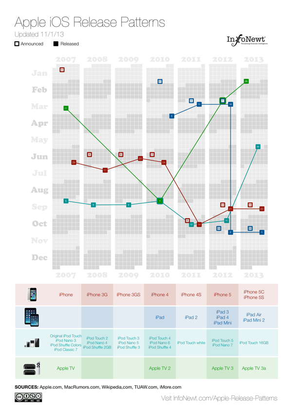
For iOS devices (iPod, iPad, iPhone and AppleTV) you can see the pattern shift in 2011 for most of the products to a Fall timeframe.  You can also see a recently consistent announcement date with the product release the following Friday.

Apple MacBook Release Patterns infographic

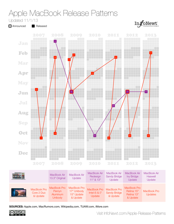
For Apple’s laptop line, the MacBooks, you can see the MacBook Air has become a regular release during the Worldwide Developers Conference (WWDC) in June, and the MacBook Pro gets fairly regular updates twice a year, usually just to update the internal specifications.

Apple Desktop Mac Release Patterns infographic

The desktop Mac line doesn’t seem to show much pattern at all.  They might get an update each year, but the timing is erratic.  Sometimes they are part of WWDC, sometimes part of the Fall iOS events, and sometimes completely on their own.

I’m going to keep updating these on the landing page as Apple releases new products in the future (upcoming iPad Mini 2 Retina and Mac Pro still need to start shipping this year).  I want these to become a valuable resource every time the Apple rumor mill heats up about the next product announcement.  If you use the embed code on the Apple Release Patterns landing page, your site will also display the updates automatically as they become available.

This is version 1.0.  I have some ideas and improvements I want to make in future versions, but I would love to hear your thoughts as well.  Post any suggestions or feedback in the comments below.

Monday
Sep302013

15 Years of Google Search

15 Years of Google Search timeline infographic

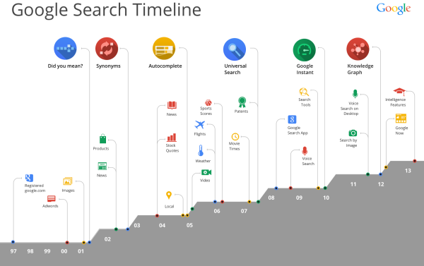
Last week, Google celebrated its 15th year, and posted the Google Search Timeline to help remember how far we have come in that time.

Google Search is turning 15. Remember what it was like to search in 1998? You’d sit down and boot up your bulky computer, dial up on your squawky modem, type in some keywords, and get 10 blue links to websites that had those words. It seemed like magic (and it was way way faster than card catalogs and microfiche!).

The world has changed so much since then: billions of people have come online, the web has grown exponentially, and now you can ask any question on the powerful little device in your pocket. You can explore the world with the Knowledge Graph, ask questions aloud with voice search, and get info before you even need to ask with Google Now.

I love the visual design, with icons and minimal text in the design to show all of the major milestones.  

I don’t understand the increasing area chart across the bottom though.  It isn’t representing any data, and each step up coincides with one of the major advancements across the top.  It’s visual, but it doesn’t have any meaning.  You would think it could show the growing total number of searches or stock price or amount of data processed.

Found on TechCrunch


Wednesday
Aug212013

A Website Design Process

A Website Design Process infographic

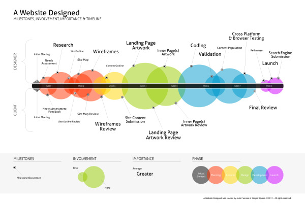
A Website Designed is a process explanation infographic, created by John Furness of Simple Square, highlights the phases of creating a website for a designer and the client. 

A Website Designed is an infographic of the average website’s creation. Feel free to download and share this, or link directly to it here on our blog.

Great visualization design of a business process.  The sequential events are arranged along a straight timeline, but a number of additional elements of information have been added.  Color-coding, sized circles and milestones all add valuable information to the reader.

A high-resolution PDF is available in multiple languages: English, French, Russian, Spanish, Italian, Hebrew and Dutch.

Found on Simple Square!

Tuesday
Aug202013

The History of Music Media - From Vinyl To Bitstreams

The History of Music Media infographic

A creative timeline view of The History of: Music Media infographic from Indigo Boom. The colors track the popularity of each new and old source of music media through the years. From left to right it goes 0% popular to 100% popular. 

Selling music as recordings first became possible in 1877 with the introduction of the phonograph cylinder. Since then media formats have developed and radically changed the way we listen, and recently even where we can listen to music. We have looked at the last 30 years of music format development and popularity in the infographic below.

Beautiful, colorful design. This is a vertical stacked area chart covering the last 30+ years of music sales. You can see that in 1980 (where the chart begins) vinyl was already in decline. CDs have had a big run, but downloads are obviously growing to become the new dominant method to get music.

I like that the design tells one story really well, and doesn’t get into a whole bunch of extra data points. It’s a simple, clear story to the readers who can understand the content quickly and then move on.  

The source listing of The RIAA is too vague.  Source listings should include a link to the specific data so others can examine the original dataset if they wish.  I went to the RIAA site, and it appears that they are selling this information in a report. Publishing the data publicly in an infographic may be a violation of the terms of service or copyright of the report, but I can’t tell because I can’t determine where the specific data originated.

The URL to the infographic landing page should be included in the footer of the design so readers can find the original when they come across a smaller version posted on another site.  Not all sites are good about linking back to the original.

Thanks to Bogdan for sending in the link!

Monday
Jul292013

Apple's Infographic Timeline Poster

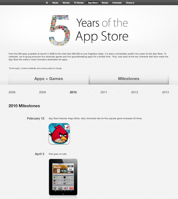
Apple Celebrates 5 years of the App Store infographic timeline poster

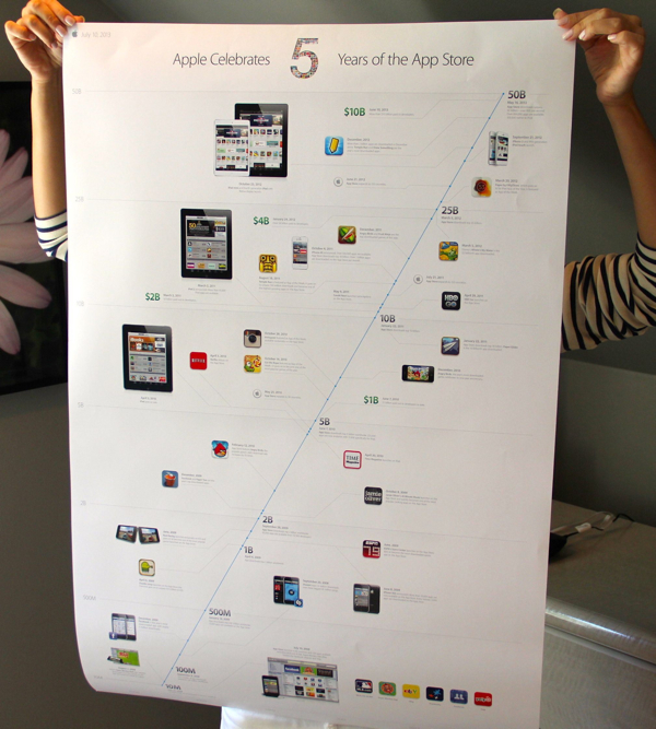
Apple just released the infographic timeline poster, Apple Celebrates 5 Years of the App Store.  Copies of this poster were sent to various members of the press.  The above photo is from Lauren Goode from All Things D.

If anyone has a copy they don’t want, I would love to get a copy!

Sadly, no high-resolution versions of the poster are available online, but the data is available to view from within the iTunes Store.  You can see the images, icons and events, but they aren’t laid out like the poster timeline.  You can view the events in iTunes by following this link.

Found on All Things D 

Tuesday
Jul092013

What Is Autism?

What Is Autism? from Global Medical Education is a long, informational infographic that covers the symptons, signs, types, treatments and history of diagnosing autism.

Autism Spectrum Disorder is very common. About 1 in 50 school aged children had parent reported ASD in 2011-2012. There have been changes in DSM-5 with the category of Autism Spectrum Disorder being introduced  which includes Autistic disorder, Asperger’s disorder, Rett’s disorder and Pervasive Developmental Disorder-NOS from DSM-IV. Researchers have studied several important questions in this disorder.

This is a big design with a bunch of good information.  However, I think it’s way too much text for an infographic.  Infographics should make information easier to understand, and most readers won’t stick around to read this much information.  In fact, many readers won’t read any of the information because that much text is intimidating and implies an investment of time and attention by the reader.

The information is fantastic, and should have been broken up into multiple infographics to cover the different topics.  This would make the information easier to digest, and would also spread out links and views to the hosting site over a longer period of time.

Thanks to David for sending in the link!


Monday
Jun032013

The History of NFL Logo Designs

The History of NFL Logo Designs infographic

Football is extremely popular in the United States. People pick sides and cheer on their teams loyaly.  The History of NFL Logo Designs infographic posted on Visual.ly tells the story of each football team’s logo through the years.

In Infographics below we are going to show you some of the interesting logo design changes across the (NFL) community with their territory maps.

Cool design that shows visual evolution of various NFL logos.

Thanks to Rachael for sending in the link!