About
Randy Krum
President of InfoNewt.
Data Visualization and Infographic Design

Infographic Design

Infographics Design | Presentations
Consulting | Data Visualizations

DFW DataViz Meetup

Join the DFW Data Visualization and Infographics Meetup Group if you're in the Dallas/Fort Worth area!

Search the Cool Infographics site

Custom Search

Subscriptions:


Feedburner

The Cool Infographics® Gallery:

How to add the
Cool Infographics button to your:

Cool Infographics iOS icon

- iPhone
- iPad
- iPod Touch


Read on Flipboard for iPad and iPhone

Featured in the Tech & Science category

Flipboard icon

Twitter Feed
From the Bookstore

Caffeine Poster

The Caffeine Poster infographic

Entries in timeline (240)

Friday
May032013

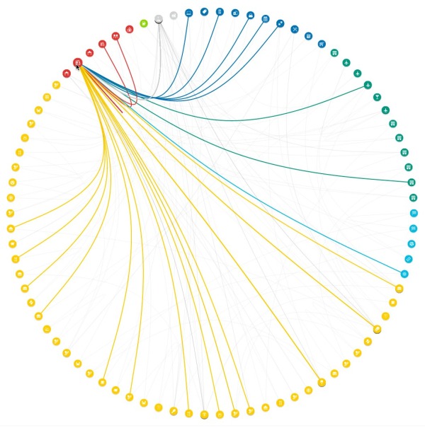
The Foursquare Visualizer

The Foursquare Visualizer interactive infographic

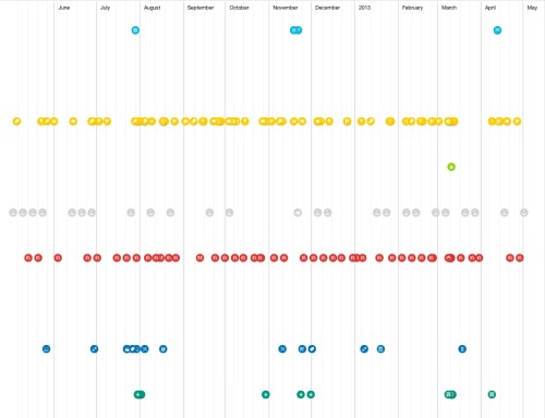
Foursquare has release a new Foursquare Visualizer, that creates an interactive data visualization of your own activity for the last 12 months.  I included the images from my own history.

At Foursquare, we’ve always known how very special our community is. Today, April 16 (4/4^2), marks the fourth annual 4sqDay. Each year, we take this opportunity to thank our amazing community for all that they do.

…take a peek back into your own history at foursquare.com/visualizeme. It’s just our small way of saying, “Thanks! We think you’re awesome.”

There are a handful of different visualizations of your own history of check-ins available.  The connection circle (shown above) is the best looking.  Other visuals include a Timeline and Categories.

Found on the Foursquare blog


Friday
Apr262013

2,000 Years of Continental Climate Changes

2,000 Years of Continental Climate Changes

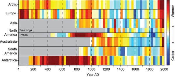
Climate change is a complicated, and sometimes controversial, global topic.  I really like this data visualization of 2,000 Years of Continental Climate Changes that was included as part of the report published by the “2K Network” of the International Geosphere Biosphere Program (IGBP) Past Global Changes (PAGES) project.

Thirty-year mean temperatures for the seven PAGES 2k continental-scale regions arranged vertically from north to south. Colors indicate the relative temperature. The most prominent feature of nearly all of the regional temperature reconstructions is the long-term cooling, which ended late in the19th century. North America includes a shorter tree-ring-based and a longer pollen-based reconstruction. Modified from: PAGES 2k Consortium, 2013, Continental-scale temperature variability during the past two millennia, Nature Geoscience, DOI:10.1038/NGEO1797.

Each color band represents a 30-year mean temperature found on each continent.  Their choice of data visualization method is very compelling, and visualizes a huge amount of data in a small space.

I also love that a good data visualization can attract attention and build awareness all by itself.

Found on the post by Andrew Revkin on the NY Times Dot Earth blog.

Wednesday
Apr102013

How Corporate Logos Evolve

How Corporate Logos Evolve infographic

How Corporate Logos Evolve, from The Logo Company, shows us how even iconic world-wide recognized company logos change over time.

We often get asked for a logo design that can stand the test of time. Something that will last forever. I mean, we look at all these “Mega Corporates” and their logos never change. Do they? Well, actually and surprisingly, they do….a lot.

This illustration depicts some of the biggest global brands and highlights the evolution of their logos from humble beginnings to the present day. It might strike you how some of the designs started out looking like their biggest rivals and others appear to of hardly changed at all. Timeless is certainly not the overriding characteristic of most of these early creations.

This is a perfect use of an informative infographic that ties directly into a company’s business, and makes for a great content tool for marketing.  The big challenge in the coming years will be the relevance of infographics to the sites that publish them, and this is the right way to do it.  Informative, entertaining infographic that is directly relevant to the hosting website without specifically being an advertisement for their business.

They should have included a copyright (or Creative Commons) license and the direct URL to the infographic blog post in the footer of the design.  That way the information travels with the infographic as it is shared and posted across different sites.

Found on Best Infographics

Tuesday
Apr092013

JAWS

JAWS infographic

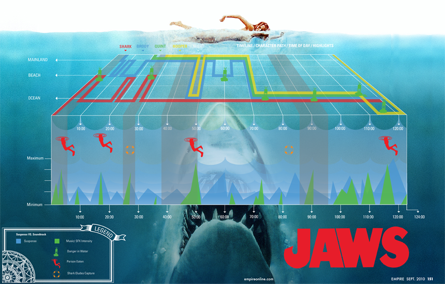
I’ve been meaning to post this one for a long time.  JAWS, designed by Robert Machuga, uses the design style of the movie poster to create this cool infographic that visualizes multiple dimensions of data from the movie.

From Robert:

This project was an assignment in my senior year at the Hartford Art School where my class had to dissect a movie and translate it into an infographic Each of the colored lines represents the location of each of the main characters in the film divided into beach, mainland, and ocean. The red icons represent each time a human was eaten while the green buoy icons represent danger in the water. The orange lifesaver icons appear when the shark eludes capture and the timeline across the bottom spikes in green at points of musical intensity while the blue spikes are moments of suspense. 

In approaching this project I really had to sit down with the film and the remote, fast forwarding and rewinding, trying to find the most pivotal events and themes that I could use to depict this movie in a static visual. I was trying to capture the thrill of the movie without loosing the story in the graph so I tried to break it down to it’s simplest forms. After many rounds, encouragement and great advice from professor John Nordyke I was left with the graph I have now. 

Nice job Robert!

Wednesday
Mar202013

The History of Home Heating

The History of Home Heating infographic

Fun timeline of The History of Home Heating infographic by global home improvements. See how far we’ve come in home heating and the plans for the future. With the current heating technologies, we could reduce the harm that we are doing to the planet.

This is mostly a visual explanation using illustrations, but does a good job of clearly telling the story to the readers with the sequence of evolving heating images.  The isometric, video-game style illustrations draw in the reader and make the information more engaging and interesting to read.

Thanks to David for sending in the link!

Tuesday
Mar052013

The History of Prime Time Television

The History of Prime Time Television infographic poster


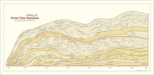
The History of Prime Time Television is a new infographic poster from HistoryShots co-founder and designer Larry Gormley.  Covering 70+ years of television history, the timeline plots out the most important/popular/trendsetting shows grouped by genre.

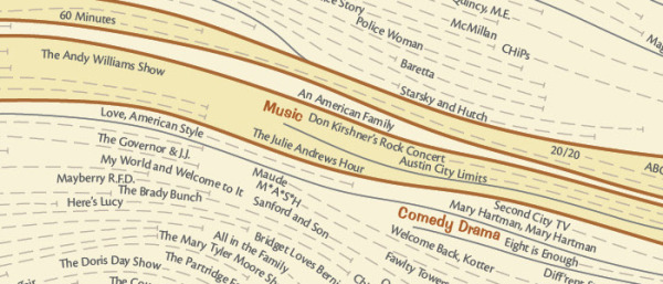
This graphic charts the history of prime time television from the origins of the industry in 1940s to the present day. More than 550 of the most important, popular, and trendsetting television shows are mapped into more than 20 genres. Shows selected have won critical acclaim according to recognized television critics or have wide audience appeal based on Nielsen ratings and awards won. The number of years each show has been aired is mapped allowing you to quickly see how long each show lasted.

This graphic was created by Larry Gormley. Reebee Garofalo’s Genealogy of Pop/Rock Music was a key inspiration for the design.

Compared to prior designs, it looks like this new project presented the additional challenge of visualizing multi-year television series, which were addressed with extended dotted lines showing the date range for each television show.

The History of Prime Time Television infographic poster

The design is available for purchase as a 41”x20” poster for $39.00 from the HistoryShots site.


Thursday
Feb072013

Syria: The Basics, an infographic presentation

Syria: The Basics is an infographic slide show using the Prezi presentation tool.  It plays like a movie, and does a great job utilizing the new features of Prezi like Fade-In animation and Audio Overlay.

Designed by Lara Setrakian (@Lara), co-founder and managing editor of Syria Deeply, a single issue news website.  Fantastic design work!  The presentation utilizes data visualization design concepts including relative sizing to put the size of the country into perspective, a timeline layout of events, related news photos and world map information.

Syria: The Basics, an infographic presentation

Friday
Feb012013

America's New Minority

America's New Minority infographic

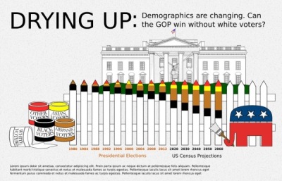
The demographics of America are changing, and America’s New Minority from 59 Liberty shows us how far we have come and predicts the next 40 years.  

With the country’s changing demographics, whites will drop under 50% of the population in the 2040s. Every Republican Presidential candidate since 1968 has won the white vote, but with the population shift can the GOP compete?

This graphic simply presents the data of a changing electorate. We went through numerous iterations attempting to find something appealing that presented the data accurately.

We worked with Projects by Chi/Donahoe on concepts, Ripetungi on design, and Hustle Labs for PR support.

For direct access to the data used, please view the spreadsheet here.

I really like how simple and strong the message is with this design.  The data will be surprising to many people, so it should be popular with social sharing.

I LOVE that they include a link to the raw data in a Google Docs spreadsheet for anyone to get their hands on the raw numbers from the data sources.  The link is in the additional text on the infographic landing page.  It would be more effective if the URL of the infographic landing page and the Google Docs spreadsheet were both included in the infographic so they would be readily available to readers who see the infographic posted on other sites.

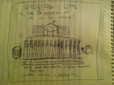
They also share some of the early drafts and other versions of the design they considered on the infographic landing page.  You can see a couple here, but there are more on the page at 59 liberty.

America's New Minority infographic

America's New Minority infographic

Thursday
Jan312013

The History of Microsoft Office

The History of Microsoft Office infographic

Word, PowerPoint and Excel are the Holy Trinity of work productivity. This is the package that makes up Microsoft Office. The History of Microsoft Office infographic from Best STL (microsofttraining.net) highlights the history of past Microsoft Office releases and a preview of the 2013 version just released.

With MS Office 2013 launching soon (see below), let’s go back in time  to look at the Microsoft Office story so far.  When launched in 1990 it was called “The Microsoft Office”.

Which version was your favourite? Do you prefer an old faithful?

The design is great.  Easy to read and not too much information.  I’ve used every version of Office they have shown in the timeline.

At first, I thought this might have been an official Microsoft design, but it’s really from Best STL, who is a Microsoft partner.  It looks so much like a Microsoft design, they may be pushing the Fair Use of Microsoft’s trademarks a little further than I would be comfortable with.

Thanks to David for sending in the link!

Wednesday
Jan232013

LEGO Minifigs

LEGO Minifigs infographic

The LEGO Minifigs infographic is a history of LEGO Minifigs (Mini Figures). The infographic designed by Hot Butter Studio for visual.ly includes the dates when characters were introduced or when a certain feature was added. An added bonus to the infographic is the information about female LEGO minifigs and the FRIENDS line that was designed primarily for girls.

This is a fun infographic with some interesting factoids that will keep readers engaged with the design.  LEGOs are cool right now, so the timing for this design is good.  It’s also a topic that has not been well covered in infographics, so it stands out as unique information.

I wish a few of the data points were visualized like number of minifigs sold each year or space events along an actual timeline visual.

Thanks to Karyn for sending in the link!