About
Randy Krum
President of InfoNewt.
Data Visualization and Infographic Design

Infographic Design

Infographics Design | Presentations
Consulting | Data Visualizations

DFW DataViz Meetup

Join the DFW Data Visualization and Infographics Meetup Group if you're in the Dallas/Fort Worth area!

Search the Cool Infographics site

Custom Search

Subscriptions:


Feedburner

The Cool Infographics® Gallery:

How to add the
Cool Infographics button to your:

Cool Infographics iOS icon

- iPhone
- iPad
- iPod Touch


Read on Flipboard for iPad and iPhone

Featured in the Tech & Science category

Flipboard icon

Twitter Feed
From the Bookstore

Caffeine Poster

The Caffeine Poster infographic

Entries by Randy (1654)

Tuesday
Jun062017

The Sci-Fi Timeline

The Sci-Fi Timeline

The Sci-fi genre contains some fantastic and horrifying ideas about the future, but how far away are they? The Sci-Fi Timeline created by Glow places classic sci-fi movies and games on a very long timeline.

We're all used to seeing movies and games set in the future, but often the date can seem a bit abstract.

We've brought together some of our favourites to show yo the timeline and where they all fit. There were some surprises!

See for yourself, and decide if the writers got it right!

Thanks to David for the link!

Friday
May262017

The Colors of Mister Rogers' Cardigans

Every Color Of Cardigan Mister Rogers Wore infographic

Owen Phillips was recently transfixed watching a Mister Rogers' Neighborhood marathon, and after finding the data, visualized Every Color Of Cardigan Mister Rogers Wore From 1979–2001 for The Awl.

From Owen:

For the past few days I’ve been transfixed by the “Mister Rogers’ Neighborhood” marathon that began on Monday afternoon over on Twitch. Like watching the “Joy of Painting” with Bob Ross, zoning out to “Mister Rogers” is an exercise in escapism. After Rogers helped reset my brain I began to wonder about all the handsome, colorful sweaters he famously wore. Did Rogers have a favorite?

Fortunately, Tim Lybarger, a 40 year-old high school counselor from just outside of Champaign-Urbana, Illinois, wondered the same thing a few years ago. Back in 2011, on his blog devoted to all things Mister Rogers, neighborhoodarchive.com, Lybarger recorded the color of every sweater Rogers wore in each episode between 1979 and 2001. “When I realized such a resource didn’t exist,” Lybarger told me over email, “I just felt like somebody needed to do it…might as well be me.”

The chart above uses the data Lybarger meticulously collected to show how Rogers’ preferences for the color of his cardigan changed over time.

Every Color Of Cardigan Mister Rogers Wore Linear

When Owen organized them in a linear order, he found that color trends definitely appears. Later years had many more darker colors.

Found on FlowingData

Wednesday
May242017

Interactive Cocktail Shaker

Interactive Cocktail Shaker interactive infographic

David McCandless and the team at Information Is Beautiful have created this impressive Guide to Cocktails in both interactive and static versions.

75+ classic cocktail recipes from the International Bartender’s Association’s list of drinks every bartender should know.

Forget old-school measures like ml and oz. We’ve calculated our own universal metric. One of any ingredient represents one part of any measuring vessel you choose: cup, spoon, lid, shoe, whatever – it’s your party! These universal recipes scale up for any level of mayhem. Enjoy! Um…responsibly of course.

Select the booze in your cabinet: our 'measurement agnostic' interactive will conjure the rest.

All of their designs are very Data Transparent, and they have made all of the data from this design available in this Google Spreadsheet listed in the footer for anyone to see.

Tuesday
May232017

How Do You Spend the Days of Your Life?

How the Average Working Adult Spends Days

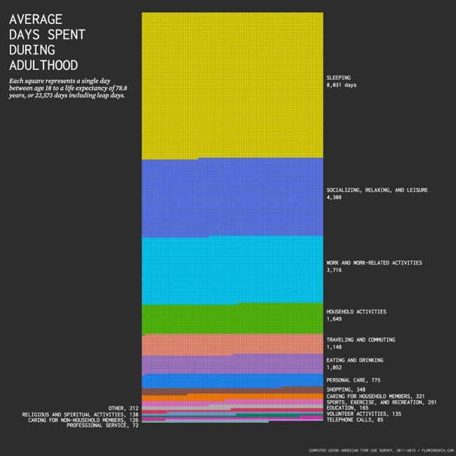
Nathan Yau from FlowingData has taken an in-depth look at the statistics behind How the Average Working Adult Spends Days in their lifetime.

There were some graphics going around that showed the total amount of time spent during an average person’s lifetime doing things. The numbers were pretty rough though.

For example, to calculate the number of days spent sleeping during a lifetime, it was assumed that the average person sleeps eight hours per day, and then estimates just extrapolated for life expectancy. But sleep patterns change as you age. You start to sleep less as you get older.

So I tried taking this into account using data from the American Time Use Survey. I still used averages, but I calculated averages for each year of life and then aggregated. Here’s what I got for adulthood (18 and older) — the time you’re presumably making your own choices. Employment and retirement are assumed.

Again, these are still averages for an adult who works and then retires around 65 years, so the same caveats apply as usual. Everyone’s own totals will be a bit different, especially as you compare across groups. For example, the time distribution for parents looks different from the distribution for those who never have kids. Similarly, some never enter the labor force whereas others work full-time.

The data is from the American Time Use Survey, which is made more easily available from IPUMS. After downloading data for 2011 through 2015, I tabulated and charted in R. Also, maybe you noticed that the number of squares doesn’t quite add up to 22,573. This is due to rounding, which offset the total above by three days.

I prefer data visualizations like this that show the actual number of days as squares (or other shapes/icons) instead of summarizing them together into a stacked bar chart or a doughnut chart. Seeing the full number of days represented gives the readfers a better understanding of the true magnitude of the values being shown

Found on Big Think

Wednesday
May172017

How 5 Tech Giants Make Their Billions

How 5 Tech Giants Make Their Billions

How 5 Tech Giants Make Their Billions is a good doughnut-style data visualization design from Visual Capitalist.

These five tech companies are the most valuable stocks in the U.S. market, worth a collective $2.9 trillion in market capitalization. In 2016, these companies combine for $555 billion in revenue, and a $94 billion bottom line.

Each of these companies is pretty unique in how they generate revenue, though there is some overlap:

  • Facebook and Alphabet each make the vast majority of their revenues from advertising (97% and 88%, respectively)
  • Apple makes 63% of their revenue from the iPhone, and another 21% coming from the iPad and Mac lines
  • Amazon makes 90% from its “Product” and “Media” categories, and 9% from AWS
  • Microsoft is diverse: Office (28%), servers (22%), Xbox (11%), Windows (9%), ads (7%), Surface (5%), and other (18%)

The doughnuts are simple and easy to read with match brand colors and a minimal number of slices. I always prefer that pie charts and doughtnut charts consistently start at the top, but these are aligned with the callouts to the right. I also prefer the slices to be sequenced in descending order.

One potential issue is that the doughtnut charts are all the same diameter, which can visually imply that all of these companies are similar in size. I know the market capitalization, revenue and earning are shown in bars to the left, but they're much smaller. I think it would work better if the doughnut charts were actually sized to match each company's revenue number.

Monday
May152017

Elon Musk's Resume of Failures

Elon Musk's Resume of Failures infographic

It's very common for super successful people to have their fair share of failures along the way. But Elon Musk has an astonishing amount of failures that has led to his massive success! In fact, so many that Kickresume has created a resume out of them. The Elon Musk's Resume of Failures highlights his major negative business and personal moments in his adult life. Probably more of a timeline than a resume.

Failure is frustrating. Failure is something you don’t put on your resume. On the contrary! One does not simply write a resume of his or her failures (Hint: we’re going to do it). At the same time, if you attempt great things, your failures are probably going to be just as impressive as your accomplishments.

There’s probably no other person alive today who embodies this notion more than Elon Musk.

Sure, he’s considered a genius who also happens to be worth $14 billion.Certainly, many of his ideas have turned into realities. Arguably, he revolutionised every industry he has ever touched: eCommerce (PayPal), automotive industry (Tesla), space flights (SpaceX), and sustainable energy (SolarCity). Still, all of these accomplishments pale in comparison to his ability to fail.

Read more at https://blog.kickresume.com

Thanks to Tomas for sending in the link!

Friday
May052017

Six Maps that Show America’s Infrastructure

Tim Meko, a graphic reported at the Washington Post, designs some fantastic data visualizations. Six Maps that Show the Anatomy of America’s Vast Infrastructure is a great visual exploration of what makes America run. Check out the original article for more explanation of each map and more visual details.

Found on FlowingData

Thursday
May042017

Evolution of the Game Console

Evolution of the Game Console infographic

The Evolution of the Game Console infographic from OnBuy.com remembers our childhood with a timeline of the last 18 major game consoles.

Bound to bring back fond childhood memories, (for most of us!) our infographic takes you through the fascinating evolution of the home games console. Dating back to 1972 when the Magnavox Odyssey was released, our infographic will guide you through the technological advancements of the last 45 years, right up to Microsoft’s 4K-ready Project Scorpio, set to launch in December 2017.

Intrigued? We bet! Now, kick back, relax and enjoy the wonderful world of gaming.

As much as I like the content and remembering playing on the consoles, this timeline is not well designed. It's not that hard to actually line up the consoles with the correct years instead of just showing them in pairs no matter what the dates are. Why even bother putting them into chronological order if you're not going to line them up correctly?

For businesses, a timeline history of their industry is a great topic idea for an infographic.

Thanks to David for sending in the link!

Tuesday
May022017

A History of Space Travel infographic poster

A History of Space Travel is a new infographic poster from Pop Chart Lab that covers the spacecraft, launch vehicles, space suits and mission timelines from countries all over Earth. Prints of this 24"x36" poster are available for $35 unframed, or more for framed options.

Make some space on your wall for our second infographic foray into the final frontier! This timeline of crewed space missions maps out over 400 extraterrestrial expeditions, spanning 1961 to present day. From the inaugural space race of Vostok vs. Mercury to the famed Apollo program to the International Space Station, this giant leap of a chart features stellar annotations for each mission, including full-color illustrations of all spacesuits and spacecraft. A simply stunning celestial survey, this chronicling of cosmic voyages is sure to have starry-eyed enthusiasts totally over the moon.

Wednesday
Apr262017

Visualizing Climate Change

Climate Change is Rewriting the History Books is an infographic from Climate Central that uses a heatmap design style to show how average temperatures have changed over the last 137 years.

This March clocked in as the second warmest March on record when compared to the 20th century average, according to newly released data from the National Oceanic and Atmospheric Administration. NASA data published last week came to the same conclusion, comparing temperatures to a 1951-1980 baseline.

The NOAA data shows the planet was 1.9°F (1.05°C) above the 20th century average for March, the first time any month has breached the 1°C threshold in the absence of El Niño. This March is the latest freakishly hot month following three years in a row of record heat.

NOAA and NASA baselines don’t really tell the whole story. How much the world has warmed since pre-industrial times is a crucial measuring stick for international climate talks and a more accurate representation of how much climate change is altering the planet.

Using the baseline of 1881-1910, a new, more dire picture of global warming emerges. This March was 2.4°F (1.3°C) above the pre-industrial average by that measure. More notably, this March marks a whopping 627 months in a row of warmer than normal temperatures. If you were born after December 1964, you’ve never experienced a month cooler than average on this planet.

To understand what that looks like, take a peek at the global temperature chart below. Each month is represented by a box. Cool blues have been disappearing, replaced by a wave of unending heat. Climate change is likely to continue the streak of warmer than normal months into the foreseeable future as temperatures keep marching upward.

There are a few things about this design worth commenting on:

  • I'm accepting the data from NASA and NOAA at face value, because this blog discusses the visual communication and design of data. However, I can't find the data they used. It would be helpful if they provided the final data they used to build the visualization. Provide a spreadsheet with the data as an act of data transparency.
  • This looks like a great use of the Conditional Formatting capability in Microsoft Excel. If it wasn't designed in Excel, it easily could be.
  • Heatmaps or choropleth maps (ie. using color hue, density, shading, opacity, or saturation) are impossible for the reader to differentiate the exact difference between the values. You can get a general impression, but this is at the bottom of the Scale of Graphical Perception
  • In a heatmap, the designer chooses the minimum and maximum values, and the data dictates all of the actual color saturations shown for each month. The minimum would be solid blue, the midpoint would be white and the maximum value would be solid red.
  • In this case, the chart colors start near the average, not the minimum value. So, all of the months from 1881-1910 are very close to white because these are the values that were used to calculate the midpoint
  • The maximum temperature value is 1.9° higher than the average, and that value is shown as the fully saturated red color. This is a choice by the designer, and makes the average temperatures in the highest months visually appear as very dramatic.
  • This is the default setting for a function like Conditional Formatting. It takes the maximum value in a given dataset, and correlates that to the maximum color saturation. It's up to the designer to decide if this default setting is correct for visualizing the data.


  • The article suggests that the trend will continue with warmer temperatures in the future, so an alternate choice the designer could make is to set the maximum color saturation to something like 10°F over the Baseline. The current temperatures would look much less dramatic, but it would allow for future higher temperatures to be displayed on the same scale.


The choices a data visualization designer makes has a huge impact on how the data is perceived by the audience!

Page 1 ... 5 6 7 8 9 ... 166 Next 10 Entries »