About
Randy Krum
President of InfoNewt.
Data Visualization and Infographic Design

Infographic Design

Infographics Design | Presentations
Consulting | Data Visualizations

DFW DataViz Meetup

Join the DFW Data Visualization and Infographics Meetup Group if you're in the Dallas/Fort Worth area!

Search the Cool Infographics site

Custom Search

Subscriptions:


Feedburner

The Cool Infographics® Gallery:

How to add the
Cool Infographics button to your:

Cool Infographics iOS icon

- iPhone
- iPad
- iPod Touch


Read on Flipboard for iPad and iPhone

Featured in the Tech & Science category

Flipboard icon

Twitter Feed
From the Bookstore

Caffeine Poster

The Caffeine Poster infographic

Entries by Randy (1654)

Monday
Mar202017

What 770,000 Tubes of Saliva Reveal About America

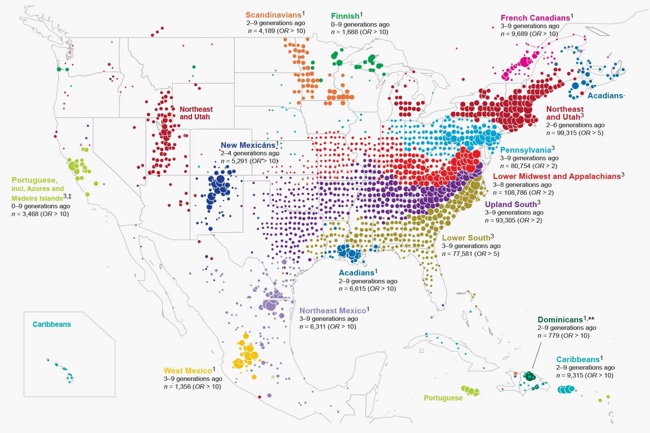
Yep, it's a Map of America’s Diversity using the genetic data from the analysis of saliva samples. Ancestry.com gathed the data from 770,000 salva samples.

This unique map shows this country’s great migrations, the echoes of our pioneer ancestors in our genes today.

Each color on the map represents a present-day community of individuals tied together through their genetics. And the location of the dots show where each community’s ancestors lived over generations.

People moved east to west, less so north to south. See how the differently colored clusters form distinct horizontal bands? The red, blue, purple, and green dots fan out from right to left. This pattern means DNA confirms the descendants of immigrants to the East Coast moved westward.

While people certainly moved back and forth from the north to south as well, if people had moved in the same volume from north to south, you’d see the bands fanning downward and not just from east to west.

But instead you can see powerful forces pushed people westward, even showing that the Mason-Dixon line separates some of the clusters.

Catherine Ball, chief scientific officer at Ancestry and the leader of the study, commented to Wired“I have to admit I was surprised by that. This political boundary had the same effect as what you’d expect from a huge desert or mountain range.”

And not only can you clearly see the migration patterns westward, you can also see distinct communities of immigrants and their descendants.

Maps were generated with the maps R package using data from the Natural Earth Project (1:50 m world map, version 2.0). These data are made available in the public domain (Creative Commons CC0).

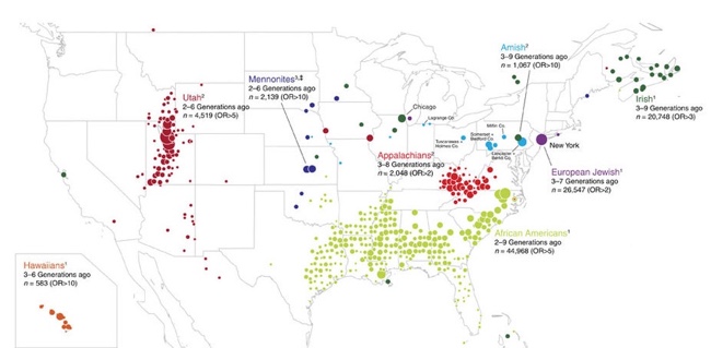
Also from the original study:


Saturday
Mar042017

Planes, Trains & Automobiles of U.S. Presidents

Official Vehicles of the President of the United States – TitleMax.com – Infographic

Official Vehicles of the President of the United States is an infographic from TitleMax showing the evolution of the vehicles used by Presidents throughout our history.

When the POTUS (President of the Unite States) has to get around, he usually does it in style. And if he’s not in style, at least we know that he’s often surrounded by millions of dollars’ worth of security detail.

Yes, for the U.S. president, cars and vehicles have always been expensive, as has been Air Force One. History has put a spotlight on the presidents’ one-of-a-kind planes: mobile White Houses, with all of the protections therein.

This information is much better shown visually like this infographic than a text bullet list. I would like to see them placed on a timeline to better line them up and show where their use overlapped.

The infographic itself is missing a copyright statement, a citation of sources, and the URL for readers to be able to find the origial full-size infographic published by TitleMax.

Found on Infographic Journal

Wednesday
Mar012017

A Visual Explanation of Gerrymandering

A Visual Explanation of Gerrymandering

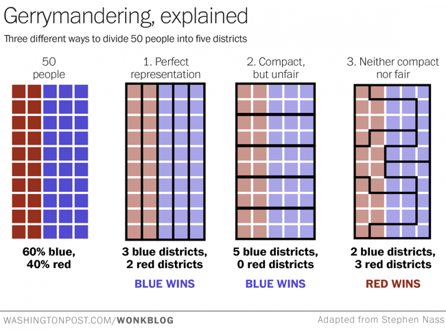
The Washington Post recently published this simple but very effective visual explanation of Gerrymandering: How to steal an election: a visual guide

Gerrymandering -- drawing political boundaries to give your party a numeric advantage over an opposing party -- is a difficult process to explain. If you find the notion confusing, check out the chart above --  adapted from one posted to Reddit this weekend -- and wonder no more.

Suppose we have a very tiny state of fifty people. Thirty of them belong to the Blue Party, and 20 belong to the Red Party. And just our luck, they all live in a nice even grid with the Blues on one side of the state and the Reds on the other.

Now, let's say we need to divide this state into five districts. Each district will send one representative to the House to represent the people. Ideally, we want the representation to be proportional: if 60 percent of our residents are Blue and 40 percent are Red, those five seats should be divvied up the same way.

This is a great example of using data visualization to explain a complex process. The use of the matrix of squares to represent people simplifies the context and keeps the audience attention focused on the groupings.


Monday
Feb272017

O'Reilly Design Conference 20% Discount

The O'Reilly Design Conference will run from March 19-22, 2017 in San Francisco, CA. Cool Infographics readers can get 20% OFF the registration cost by using this LINK and the discount code PCCOOL

It’s no longer enough to solve creative problems well; designers must also be business-literate and tech-savvy. Join us to learn new skills—and build your career—at the sweet spot where design, business, and technology intersect.

As the combination of design and technology continues to revolutionize products, services, and the very nature of competition, the role of the designer is ever more critical. Whatever your title, if you contribute to design decisions, you need to be prepared. At the O’Reilly Design Conference, interaction and UX designers, user researchers, product designers and managers, and entrepreneurs will share important lessons on how to make a lasting impact on your organization—and the world beyond—through design.

If you're anywhere around the San Francisco area, or can make the trip, this is a fantastic conference!

Monday
Feb202017

Millions of Lines of Code

Codebases: Millions of Lines of Code infographic

Codebases: Millions of Lines of Code is another great infographic from David McCandless and Information Is Beautiful showing the massive complexity of today's modern apps and programs.

Is a million lines of code a lot? How many lines are there in Windows? Facebook? iPhone apps?

Great use of the matrix of squares to represent scale. I do think the users can lose their perception of scale when the section changes jump different values. If it was always a factor of 10, that would be clearer.

Friday
Feb172017

A Year of Driving 2016

A Year of Driving by Automatic infographic

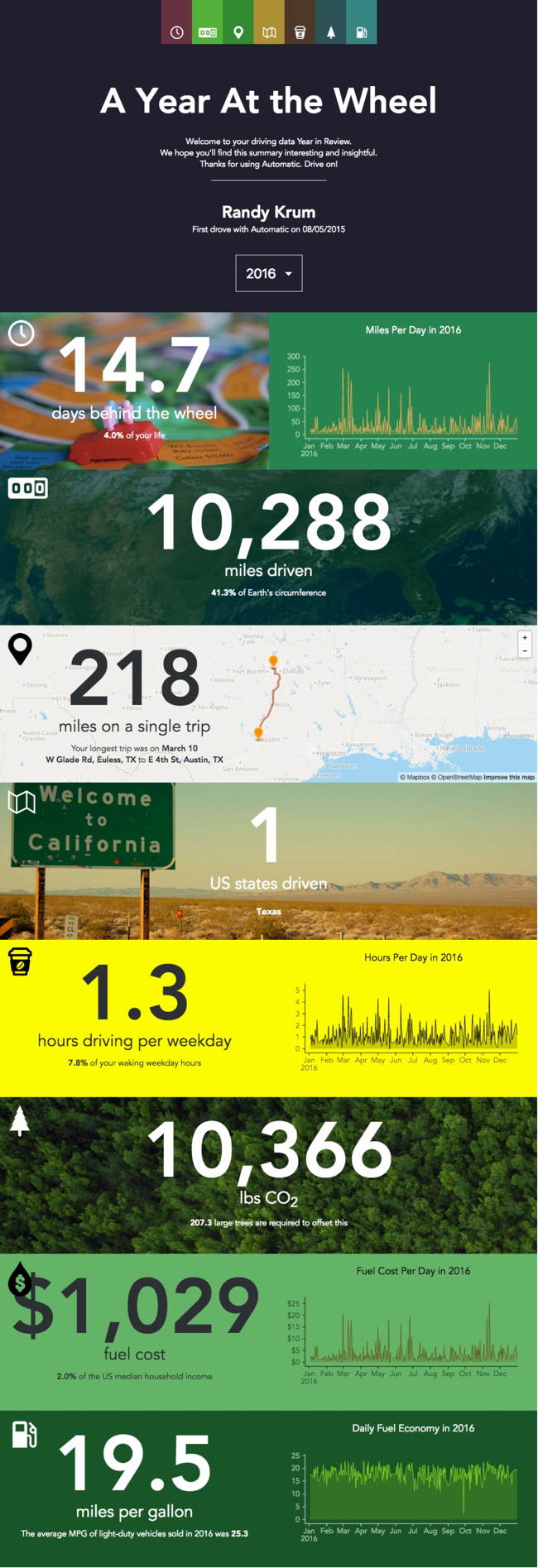
A Year At The Wheel. If you are an owner of an Automatic connected car adapter, they create a personalized infographic with your own custom data.

A number of companies have started creating personalized data visualizations and infographic for their customers, which is a trend that I really like. As part of Automatic Labs, the Year In Review graphics give you insights into your own personal driving history data that you couldn't see anywhere else. One of many ways they are experimenting making your personal big data useful.

Big fonts are not data visualizations! My biggest critique is that there are sections that just show the data value in a big font. They were too lazy to create visualizations for the comparisons. For example, they took the time to calculate that 10,366 lbs of CO2 would require 207 large trees to offset, but a visual of 207 tree icons would be way more impactful!

Wednesday
Feb152017

Bold & Justified: The Huge World of Typography

Bold & Justified: The Huge World of Typography infographic

Coulor Lovers has done some etensive research on typography and has compiled it into their Bold & Justified: The Huge World of Typography infographic. A lot has changed since 1452 when the first movable type was invented. Now every business and brand can have their own unique typeface.

Comic Sans is installed more on PCs. Why so serious Linux & Mac? That's just one of the many things we discovered while looking into the creative history of typography aka fonts. They play a huge part in branding and logos. They bring us the words in the stories we read. They add personality to a message. ... and with CreativeMarket.com, our new marketplace for beautiful design content like fonts launching soon, we wanted to bring the typographic history, usage & character to life. Get your typographic love on!

The content in this one is fantastic, but they took some creative liberties when it comes to visualizing the data. A common error is sizing circle incorrectly by changing the diameter to match the data instead of the area (See more HERE). The lengths of the ties in the Style section is just creative illustration, and doesn't match the data values. The doughnut chart on the "Type On The Web" section doesn't add up to 100%!

I love the depth of details they put together, but the data visualization details are disappointing.

Friday
Feb032017

The Evolution of Technology Company Logos

The Evolution of Technology Company Logos infographic

Logos are very important for a company's image, it needs to be simple and memorable. The Evolution of Technology Company Logos infographic from Vizion Online shows a few companies that have very recognizable logos. As you can see, even the professionals tweak their logos often to get the desired look and feel.

Here we have a good looking infographic that we have designed providing information about how technology company logos have evolved over the years. Check out logo evolution for companies such as Amazon, AT&T, Canon, Dell and more by viewing this logo design piece.

We hope that you enjoy this tech company logo infographic and please share it out with your friends on social media or feel free to publish it on your blog or website.

Thanks to the Picture Superiority Effect, people at more likely to remember the company logo than the company name. I talk about this in Chapter 1 of the Cool Infographics book, called the Science of Infographics. You can download an excerpt of that chapter for free HERE!

Thanks to David for sending in the link!

Monday
Jan302017

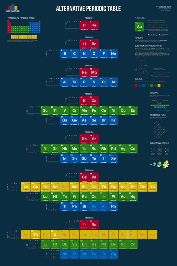
The Alternative Periodic Table

The Alternative Periodic Table infographic poster

The Alternative Periodic Table is a new project from Matt Baker at UsefulCharts being funded through a Kickstarter campaign that ends on February 9, 2017. Act fast to get your copy and help support Matt!

From Matt:

Recently, I decided to tackle the most famous chart of all... the periodic table!  Considering that they just added 4 new elements, the timing could not be better. Anyway, here's what my version looks like:

You'll notice that it looks quite a bit different from the one you're used to. The video at the top of the page explains why. In short, the traditional periodic table is designed to emphasize the concept of valence, which is important for knowing which elements can easily combine with others to form compounds. In contrast, my alternative periodic table is designed to simply emphasize the way in which atoms are "built" (specifically, how electrons group together into shells and subshells). It's based on a design proposed by Edward Mazurs in the 1960s.

Like the traditional table, this alternative version can be used to find an elements name, number, atomic weight, state of matter, period, group, and block.  However, it also contains detailed information on electron configurations and the different types of electron subshells.

Thursday
Jan192017

Strata + Hadoop World Discount & Giveaway

The Strata + Hadoop World conference in San Jose, CA is coming up on March 13-16, 2017! Readers of Cool Infographics enjoy a 20% Discount by following THIS LINK and using the code PCCOOL!

Act fast! The 20% discount will continue to work all the way up until the conference, but to get the best deal Early Pricing ends on Friday, January 20th!

This month, I'm also giving away one free Bronze Pass to the conference. Register for your chance to win the free conference pass on the Giveaways Page!